
Even though we all have been constantly hearing the phrase that one must not judge a book by its cover. In spite of that, each one of us is guilty of doing so every time we come across a bewitching print lying innocently on a shelf.
So, all in all, it might not be wrong to conclude that covers do play a massive role in attracting readers. Or sometimes, they can even warm the cold hearts of non-readers, forcing them to buy the novel only to decorate it on their tables.
Have you ever come across a book cover so captivating that it led you to question where the artist found the inspiration? If yes, then you have landed on the right page. Read this blog to get to know how UK artists create such dazzling fantasy covers.
Designing Aesthetically Pleasing Book Covers
Components of Book Cover Designs: Before starting to map out a fantasy cover, one must be familiar with the basic components of designing. Not only does it make the artists keener on the details, but it also helps them to determine which component needs more attention. Some fundamental elements of achieving the perfect design for your books are discuss below.
- Fonts: Typography or the fonts that are being use can tell a lot about the book. For instance, light reads often have soft or bubbly fonts on their display to help indicate their genre. On the other hand, dark or heavy reads might use somewhat edgy or heavy fonts. For instance, you can see the difference between the fonts used on the cover of Matilda by Roald Dahl and Gideon the Ninth by Tamsyn Muir to better understand the context.
Not only is the type of fonts important, but the colour and placement are also prime factors that must not be ignore. If the genre is serious, try using darker colours, but if it is a light read, then neutrals or lighter shades are encourage to be use.
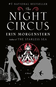
- Visual Designing: Apart from the fonts, another key factor of any UK fantasy book cover is the imagery or visual design. A book cover must be in accordance with the story, but it should be creates with depth and vision. Say, for example, the cover of The Night Circus by Erin Morgenstern gives the readers a vibe that matches the story only by looking at its cover.
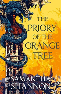
- Colour Compatibility: Selection of the right colour is also difficult, but if done properly, it can change the whole game. The artists can elevate the look of the book only by scheming the hues perfectly. For instance, the cover of The Priory of The Orange Tree by Samantha Shannon is the best example of font placement, amazing visuals, as well as the perfect colour combination.
Research on the Target Audience: In most cases, every novel is written by having a specific age group in mind. The artists must also be attentive to this fact and design each cover with the intention of catching the eye of the appropriate age group.
Therefore, before you start designing any cover. We urge you to research that book as well as the audience it is written for. By doing so, you will make sure that it falls into the hands of the right reader. By using the appropriate fonts and images that attract certain age groups, artists make sure to attract the perfect audience.
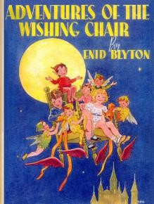
- Children: It is no secret that colours and pictures attract children more than adults. Make sure to add funky and bold hues along with fun images to match the title of children’s books to attract them. If you focus on the cover of The Adventures of The Wishing Chair written by Enid Blyton. You might be able to get the gist.
- Young Adults: Such an age group is quite difficult to target; while some people are still transitioning from child to young adult. Others might have a more mature taste. That is why it is advise to keep the cover more mature but not very serious, as it might not be able to attract the audience of that category.
One thing to keep in mind is that young adult novels are most likely read by adults as well. Paying attention to this detail may help you in the long run.
- Adults: Designing a book for adults is equally challenging. Usually, the fonts are straightforward, and the main focus is on the illustration. This alone can indicate that this fantasy novel is only to be read by the adult group.

Or you can always use an illustration of any object that might be relevant to the genre. For instance, the covers of the famous Twilight series are design in such a manner.
Steps to Tailor the Perfect Design: Although it is not child’s play to design fantasy covers. If you plan to do so in future or if you are merely interest to know what struggles an average artist faces during the process. Then read below to get familiar with the process of tailoring the perfect book look.
- Research: An artist must be well aware of the book synopsis, what’s it about, and most importantly, who’s it about. By doing so, the designer can think of relevant themes as per the target audience.
- Brainstorm: The perfect covers are not design out of nowhere. After researching, the creator should have at least 2-3 rough ideas about the cover. Even the best publishers in UK are not able to gather a sufficient audience if the cover is not catchy.
To avoid this, always analyze the title and the story to be deliver before you start your work.
- Make Sketches: To begin tailoring the art, the designer has to make a few rough sketches so that it is easier to improve, combine, or even get more inspiration from them. Finally, from these sketches, one must be able to craft one excellent piece of work.
- Get in Touch With a Good Editor: A true artist is never fully satisfy by its art. So, to become more pleased with the designs, hiring a good editor to edit your final sketch to perfection is advise.
Final Words
No matter how good the book is, the readers mostly judge the book on the basis of its cover. Therefore, it is the job of an illustrator to make it so eye-catching that it not only impress the bookworms but the non-readers as well. A creator must go through many phases of trial and error to be able to craft the cover to excellence. Make sure to keep the target audience and the story in mind. With the usage of appropriate typography, illustrations, and colour schemes. The artist can make sure that the book directly catches the eyes of the target audience.